Showing posts with label process. Show all posts

Sunday, January 16, 2011

Grisly Discovery.


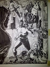
Hello everyone. This is a panel from the currently in progress Wrestler Zero story. It didn't occur to me as I was inking this panel that I'm an admirer of the "Filipino school" of art. I grew up reading many of the Marvel black and white magazines where the work of Alfredo Alcala, Rudy Nebres and Tony DeZuniga was featured. I'M NOT TRYING TO COMPARE MYSELF IN ANY WAY SHAPE OR FORM TO THESE ARTISTS. In looking at the posted panel here all of the cross hatching and shading was definitely influenced in some way by these terrific artists. Do yourself a favor the next time you're in a well stocked comic book shop and expose yourself to these great artists from the Phillipines. This panel was inked with a Hunt 102 pen, Micron .005 and .01 pens and Pitt brush pens. My ink is Dr. Martin's Bombay black. Take care out there.

Tuesday, November 2, 2010

Second time is the charm.


This is the second version of this page(see previous post for the first). I wanted to make the figures larger, more dynamic and I wanted to add a little more costuming to Wrestler Zero with the addition of a belt and the shin guards. I also rendered the figures much more than in the first version. I hope I didn't over render the page and distract from the storytelling. While I strive to improve as an artist I don't want to forget that my priority is telling the story. My drawing should be in service to the narrative. On to the next page then.

Saturday, June 12, 2010

The last word on the last page or how I phoned it in.


This is the published last page from WRESTLER ZERO #1. (see previous posts for the first two versions) I'm still without a scanner so I used my camera phone to bring this image to you. I wanted the last page to be a strong image and one that re established the status quo of the character. I'm not a huge fan of my own work. I have to maintain a student's mindset and a critical distance from my artwork or I won't grow. Once in a great while I'm somewhat pleased by what I produce and this page represents one of those rare instances. Besides, at the Boston Comic Con Mike Lilly and Scott Cohn both liked this page and when you consider what excellent artists they are, well, that felt good.

Friday, June 11, 2010

Picturing it.


It's been far too long since my last post. I have my PC back, although with so many new parts it's practically a new computer, but I don't have a scanner at the moment. The above image from the second issue of WRESTLER ZERO and was taken with my camera's phone. I'm pencilling more tightly so as to reduce guesswork during inking but allowing for some creativity as well.

Wednesday, March 10, 2010

Cover Story.


The first image is the cover to Wrestler Zero #1 and the second is the initial concept sketch. Generally, there are three types of comic book covers; one is inspired by a scene within the story, another is the "pin up" cover and yet another is what I call "the symbolic cover". The latter option often incorporates a variety of images from the story as well as elements of the first two cover types. I chose a symbolic cover. As you can see, I made a lot of changes from concept to execution. For example, in the sketch there isn't any action on the cover aside from the fist thrusting out of the grave. I wanted Wrestler Zero to be in a more dynamic pose and I hit upon the idea of him smashing his way (symbolically of course) out of a skull. Since I rely on the contrast between light and shadow pretty heavily it helped me avoid overlapping black on black areas.


I draw directly on the board using H, HB and F pencils. The cover was inked with a Faber Castell Pitt Pen, a Faber Castell Pitt Pen "S" and some Hunt 102 crow quill and a touch of Micron Pigma pen in the 001 size. I usually buy pads of Bristol paper and cut my own boards but recently I've been using a batch of pre cut/ruled boards I picked up at a steep discount. The lettering in the comic and covers was done by hand directly on the board.

Saturday, February 27, 2010

A tale of two pages.


If I were to change every panel I'm unhappy with I'd never get past panel one. Every panel, even the ones I decide to not use, is an education for me. However, there are those times when I can't let something stand and I have to re-do it. Case in point: the top page was the first version of the final page of Wrestler Zero#1, the second is the version that will see print. Both pages are depicting the same idea but I was not satisfied with the first version. The most herculean rendering in the world will not save a poorly composed page or panel. It's akin to wallpapering a crooked house. In the first version Wrestler Zero is too small and too stiffly posed. The hands of the creature in the foreground are weak looking and the background, while adequately conveying some sense of depth, has too many black on black areas. All of this is the result of not spending enough time doing preliminary layouts and a failure to compose the picture elements well.
The second version is an improvement although not without it's flaws. In this version Wrestler Zero is larger with his torso masses moving in opposition to each other. He's not as stiff as he was in the first version of this page. The hands in the foreground are also larger and not as evenly posed against each other as in the first version. Also, there is more sense of depth and no problems of overlapping black areas. In retrospect I would've liked to have had Wrestler Zero with a wider stance and with more room between his legs. These are valuable lessons for me. For those of you who may be wondering: the figures, buildings, floor and lettering were done with a Faber-Castell Pitt Pen. The sky was rendered with a black China marker and the glass and fine line work was done with a Micron pen.
If you were to ask me which aspect of my artwork I felt needed improvement I'd unhesitatingly say : "All of it".

Saturday, November 14, 2009

Something old.

A lot of professional artists seem to be embarassed by their early published work. Although I can understand the desire to be judged by your most current work, why be embarassed at what came before?

If you're giving your artwork your best effort you have no reason to be embarassed. With that in mind I present the following two pages. I found these on an unmarked disk but I thought I'd share them with you:


I wrote/drew these pages a little over three years ago. I'd approach them differently now but the basic ideas are still sound. In the first page I'd definitely make Wrestler Zero's figure more supple and in the second I'd make it clearer that the wrestling ring is in a cemetery and needless to say the artwork would be better.


But there's no shame in the game here. At the time this was the best I could do. Study the work of your favorite artists and you'll see an evolution from their beginnings to the point where you first encountered their work.

Saturday, July 25, 2009

Live and Die with your Mask on.


This is part of page one of WRESTLER ZERO. I'd love to have one of those oversize scanners that can accomodate 11 by 17 originals. This was pencilled with blue pencil and a B pencil and inked with a Pitt brush pen, a hunt 108 and with Dr. Martin's Bombay black ink. The rain was accomplished with a white gel pen. I'm currently pencilling an eight page WRESTLER ZERO story. I'm having a lot of fun with it and I hope it shows.

Saturday, July 4, 2009

The magic key.

First and foremost I want to wish everyone reading this a HAPPY 4TH OF JULY.

I had the privelege of seeing some of the world during my Navy days and it made me appreciate our country all the more.


One of the many pitfalls of being a self taught artist is the amount of time I've spent going down blind alleys. It's like exploring a new world without a map or a guide who's familiar with the lay of the land. I've read just about every "how to draw" book I could find, read interviews with artists, scanned blogs, watched videos and I've spent countless hours studying the work of artists whose work both inspires and humbles me. I was searching for some sort of a magic key that would unlock the mysteries of drawing. As time went on I found that I began to lose my fascination with certain artists and began to study the work of men that I'd ignored when I was younger. As I've gotten older I don't have all the answers but I think my questions are much better than they were. All of the time I invested in searching for that magic key wasn't in vain. I learned some valuable things along the way. But the biggest lesson of all is this: There is no magic key to be found anywhere. If you want to unlock the mysteries of drawing you have to draw, draw and draw some more. Frustration is your enemy, procrastination is your killer.


Like many an amateur I've fallen under the sway of certain artistic trends. For a time I worshipped at the altar of heavy rendering. I spent a lot of time trying to be cartoony and for a very long period everything I drew was a stylistic emulation of a certain artist's "how to" books. I'm still trying to unlearn a lot of bad habits. The drawings accompanying this entry were all done while watching movies at home.


If you're an amateur (or aspiring if you prefer) comic book artist I'd like to recommend the following books:


The Figure by Walt Reed, Anatomy for the artist by Sarah Simblet, How to draw the Human Figure by the Famous Artists School, Posefile Reference by Antartic Press, Perspective for comic book artists by David Chelsea, People and Poses, Women and Girls and Men and Boys by Impact Books, Facial Expressions by Mark Simon, The Human Figure in Motion by Eadward Muybridge, International Gymnast Magazine and Drawing magazine.


I almost forgot to include Comic Book Artist number 11, the Alex Toth issue. It's available from twomorrows.com and Mr. Toth's insights on the craft of comics make it a must read. Until next time stay encouraged and keep drawing.

Friday, July 3, 2009

Scrap paper influences


I do most of my sketching on scrap paper. I also have standard sketchbooks but sometimes that really nice paper can be a bit intimidating. The above drawing is a "scrap paper special". I think it shows a Wally Wood influence in the shading and in the shape/masses of the figure. It goes without saying that Wally Wood undoubtedly erased better drawings than I could ever produce, but I love his work nonetheless. If you're an aspiring artist or just someone who loves the best of comic book art, you owe yourself a close look at Wally Wood's artwork.

Pencil before Ink.


The above is a detail from a page of my comic book WRESTLER ZERO. In the never ending (and sanity challenging) attempt to improve my drawing I've decided that I have to focus on my pencilling and put off inking my work for the forseeable future. Inking is an artform but the best inks in the world are useless if the pencils are no good. Because this is my passion I want to be productive and publish new material as often as I can. . However, because I'm painfully aware of how flawed my work is I put a lot of pressure on myself and all too often I've jumped to the inking before making sure that the layout, composition and drawing was as good as it should've been. The result is a stack of unusable pages with an occasional panel that offers the hope that I may, if I work hard enough, someday grow into a passable artist. I've made some very small progress and each new step forward makes me hungrier for the next. So it's back to the books, the drawing board and the pencil shapener for me. As Steve Rude once said : " Hey, what else do you have to do with your life?".