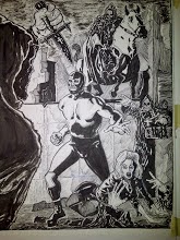

If I were to change every panel I'm unhappy with I'd never get past panel one. Every panel, even the ones I decide to not use, is an education for me. However, there are those times when I can't let something stand and I have to re-do it. Case in point: the top page was the first version of the final page of Wrestler Zero#1, the second is the version that will see print. Both pages are depicting the same idea but I was not satisfied with the first version. The most herculean rendering in the world will not save a poorly composed page or panel. It's akin to wallpapering a crooked house. In the first version Wrestler Zero is too small and too stiffly posed. The hands of the creature in the foreground are weak looking and the background, while adequately conveying some sense of depth, has too many black on black areas. All of this is the result of not spending enough time doing preliminary layouts and a failure to compose the picture elements well.
The second version is an improvement although not without it's flaws. In this version Wrestler Zero is larger with his torso masses moving in opposition to each other. He's not as stiff as he was in the first version of this page. The hands in the foreground are also larger and not as evenly posed against each other as in the first version. Also, there is more sense of depth and no problems of overlapping black areas. In retrospect I would've liked to have had Wrestler Zero with a wider stance and with more room between his legs. These are valuable lessons for me. For those of you who may be wondering: the figures, buildings, floor and lettering were done with a Faber-Castell Pitt Pen. The sky was rendered with a black China marker and the glass and fine line work was done with a Micron pen.
If you were to ask me which aspect of my artwork I felt needed improvement I'd unhesitatingly say : "All of it".
