I managed to finish Wrestler Zero number three in time for the 2013 RI Comic Con but not in time to actually print it. I was terribly disappointed in myself and still am but it turned out to be a good thing. The climax was rushed and the opening was too truncated. This is the result of rushing the work and not budgeting my time correctly. I'm reworking the climax of the story and expanding the opening as well. The result will be a better reading experience for you and a less cringe inducing memory for me. Above are two pages that I am keeping in the finished version since they occur storywise in the first third of the comic.
Hello everyone. It's been far too long since I published a new post. I have my reasons but reasons aren't excuses. 2013 has been a very challenging and instructive year to say the very least. I've posted both the pencils and the finished piece so you can see some of my process and choices. The character is "The Hammer" created by Kelley Jones to whom all rights are reserved and respected. I ran this piece by Kelley and he graciously gave his blessing for me to publish it here and on my other social media sites such as FB and DeviantArt. I very rarely draw any established characters. I honestly don't know what I could say with well known characters than hasn't already been said by a legion of far more talented folks than myself. However, I did enjoy drawing "The Hammer".
This is page four from the in the works third issue of Wrestler Zero. As with the previous post's page I lightboxed this one but made the mistake of not fully realizing the pencils in the layout stage. If I had more experience and knowledge perhaps this wouldn't be a problem but at my current skill level it led me to struggle with several areas in this page. Overall, I think it tells the story and that's job number one in sequential art but I want the artwork/compositions to be the best I can make them without calling attention to them at the expense of the story's needs. On to the next one.
Hello everyone. This is page three from the in the works third issue of Wrestler Zero. This is the first page I've produced using my lightbox to trace my layout. The immediate benefit is a much cleaner original board and one that is easier to ink. The backgrounds were drawn on the board. I inked this with a Pentel brush, Micron Pigma markers in the .002 and .02 size and a large Pitt brush pen.
This image will probably be the back cover of the next issue of Wrestler Zero. I inked this with Pentel brushes, Pitt brush pens, a Hunt 102 crow quill and a .001 Micron Pigma. My ink is Dr. Martin's Bombay Black.
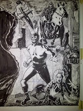
This is one of those drawings where I didn't really have a clear cut idea of where I was going with it. This was produced on 11x14 Bristol board with pencil, Pentel brush pen, Microns and a white gel pen. I also used watercolor pencils for the grays.
I'm always trying to improve my art while trying to get out of my own way at the same time. The above drawing is an example of me actually getting out of my way and of perhaps learning to see better which is a key to better drawing. I'm getting older and part of me worries that all of the things I love, and that inform my work, are now seen as "old school" and suitable only for nostalgic aging fanboys. Perhaps it's just me projecting my fears and insecurities onto the world or maybe I'm right. I can relate to the song by St. Vitus "Born Too Late". All I can do is be me and stay true to my convictions. The above drawing is the closest I've ever come to depicting Wrestler Zero as I see him in my mind's eye. It's not the bodybuilder physique you'd find in a mainstream comic( I'm not knocking it, there are a lot of great talents out there) it's a wrestler's physique. It has it's roots in Lucha Libre and old school American Pro Wrestling as well. There's an echo of that aesthetic in Tom Hardy's Bane. So there it is.
My preference is for black and white artwork but I get the urge to color every so often. This was colored with Prismacolor and Utrecht markers on 11x17 cardstock.
Hello everyone. This is a detail from a page of a short Wrestler Zero story called "Rumination". In this case it's a very short story 2 to 3 pages long. I'm still writing/editing but the whole point is to write smaller stories and produce new content for online viewing whilst working on the next issue of Wrestler Zero. I inked this with a Pentel Brush Pen and I really like this brush pen.
This past weekend I was in the artist's section of The Southcoast Toy and Comic Show in Fairhaven, MA. I met a number of very nice people and sold a number of Wrestler Zero issues and pin ups. A big "Thank You" to everyone who came by the table. I also had the chance to catch up to artists Frankie B. Washington and Matt Bessette who I'd met at last years RI Comic Con. I had the pleasure of meeting Jim "The Bard" Savard the writer behind "HELLION" and a great all around guy. That's me holding a poster of Jim's comic while he's holding his issue of Wrestler Zero.
I also opened an Etsy store to which I've linked in the links section of the blog. It's free shipping and each order receives a signed pin up free of charge. A pretty nifty deal.
Hello everyone. While it's true that one should have a firm idea of what you intend to draw sometimes it's interesting to just improvise a drawing. The above is the result of just seeing what would happen. I went to town rendering but I'm not sure if I'd want story pages to be this densely rendered for both clarity's and time's sake. I had fun drawing the gorilla although I'd never drawn one before.
Pencil and ink on smooth Bristol board. Tools used: HB mechanical pencil, Dixon/Ticonderoga B pencil, Pitt Brush pen and Micron Pigmas in the .005 and .02 range.
Here's the finished re-do of what I posted two entries ago. It was interesting to pencil without inking. It meant that I had to think as if I were inking but with my pencil. Speaking of pencils I've become a recent convert to mechanical ones. I used a Prismacolor HB thick lead and two Alvin HB leads in the .03 and .05 range. As with all drawings this was a learning experience and perhaps the beginning of a breakthrough for me.
This is part one of the re-do of my previous post. There's still lots of work to do but so far so good. I'm not going to ink this piece which is why the pencils are so tight. Ordinarily I do ink my work and I wouldn't have this much graphite on the page. However, I'm approaching this image as if someone else was going to ink it. Once it's finished I'm going to make some good quality copies and ink one of them just to see how it would look inked. I'm going to explore doing more pencilled images because that's one of the many areas where I need to improve. It's too easy to leave a lot of the work for the ink stage thus depriving me of the chance to work on the foundation of an image or page.
Greetings. This is the artistic equivalent of knowingly watching a bad movie all the way to the end because you already sat through the first third. The idea is good but the execution is poor. The same is true for the preceeding post (La Maxima). If a drawing isn't working in the pencil stage then don't bother trying to "save it" in the inks. Fix the pencils. I'm done trying to reinvent the wheel. I really need to absorb my influences instead of merely admiring them. Time for two do-overs. Stay tuned...
Here's the finished result colored with Utrecht and Prismacolor colored markers and inked entirely with Pitt brush pen and a Micron .001. Pin ups are fun and I'll do more of them but sequential art is where it's at and I need to focus on that.
Here's step one and a half of a drawing of a character I created today called "La Maxima"(The Maximum). I'll be the first to admit that my depiction of women has a long way to go before it looks good but you have to start somewhere. I like the "thick" look and Luchadoras have to be that way because they get blasted in those rings. They're just as good, and in some cases better, than their male peers. I have a lot of respect for them.
Here's the finished product. I used FW black ink applied with #2 and 4 brushes. I like FW ink but it's hard on brushes and pen nibs so I don't use it that often but it does hold up well when I'm erasing the pencils. Colors were applied with Utrecht and Prismacolor markers. I don't have a name for the Luchadora but I'd like to use her in the next issue of Wrestler Zero.
Every visual artist has his or her "thing"; that one genre or imagery they're drawn to. For some it's giant Mecha, for others sword and sorcery and for many others it's superheroes. Regular readers of this blog know what my "thing" is: the Mexican masked wrestlers in whatever media they appear in. I have a great deal of love for the American superheroes of my youth. I just don't know if I have anything to say with them. The above image is the first step in the process. At this point my concern is with creating a good composition and to depict the figures as best as I can. Gesture, shape and form before detail is the rule here.
This is my tribute to Roy Thomas/Gil Kane and Jim Starlin's work on "Warlock". Pencilled with a "B" pencil, inked with Pitt Brush pen and Micron Pigma marker .001 and colored with Utrecht color markers.
Hello friends. This year's blogging gets off to a colorful start with this tribute to a magazine I recall quite vividly from my youth. "Lucha Libre" was a magazine covering the world of Mexican Lucha Libre. It had black and white interiors and the cover was always a nice portrait of a Luchador. Although my tribute is a bit ham handed it's also very sincere.