Tuesday, November 9, 2010
Tuesday, November 2, 2010
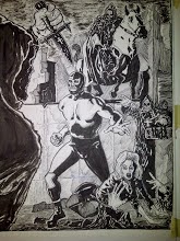
Second time is the charm.

This is the second version of this page(see previous post for the first). I wanted to make the figures larger, more dynamic and I wanted to add a little more costuming to Wrestler Zero with the addition of a belt and the shin guards. I also rendered the figures much more than in the first version. I hope I didn't over render the page and distract from the storytelling. While I strive to improve as an artist I don't want to forget that my priority is telling the story. My drawing should be in service to the narrative. On to the next page then.
Saturday, October 16, 2010
Two pages and one mini sermon.


Hi everyone. Here are two pages from a short WRESTLER ZERO story in the works. When it's complete the full version will be posted here for you to read. I wish I were in a position to publish full length stories on regular schedule. I have lots of stories I'd like to tell. However, for the forseeable future I'm better off keeping my stories short and sweet. The plain truth is I need improvement in a lot of areas of my craft. Being a self taught artist means you can't be the biggest fan of your own work. You need a strong but not harsh internal editor to keep you honest. For me that means not publishing work that I know is sub-standard. For every one page that I publish in print or electronically there are at least two other versions that didn't make the final cut. This artform is not flattering to the ego. If anything, it constantly points out your limitations as a creator and the need for constant study and practice. At the amateur level there is no money and very little recognition outside your immediate circle of friends and family. You will always meet or see the work of someone whom you consider much more talented than you. I am not aware of any self publisher who is making a living from his or her publishing. Without exception the publishing is being subsidized by a day job. And without fail there will always be the nattering nabobs of negativism ready to talk you out your desire to pursue this difficult artform.
So why continue to pursue your craft? Why continue to tilt at your own windmills? Would it not be easier to pursue something far more practical? The answer is that you do this because you must. Because you can't picture yourself not pursuing that dream or not tilting that windmill. Art, like love, is not practical but for those of us who dream it and live it it's essential. Passion and sincerity will get you through times of creative slumps better than talent can get you through times of no passion and sincerity. It's very possible, in fact very likely, that I will never make my living from my self publishing. And since I have no interest in working for any comics publishers I'd best not quit my day job. So where does that leave me? It leaves me where I've always been; passionate about creating comics and passionate about improving my ability to do so. And that my friends is not at all a bad place to be.
Sunday, September 12, 2010
Weather, comic book shops and a free comic book.

The summer season is officially over. The weather doesn't turn on a dime but already the air is cooler and the nights have me reaching for the comforters I'd all but abandoned since the end of spring. Autumn will soon be here and it's my favorite time of year. It's neither hot nor cold but a transition from one season to the next while retaining elements of the past and hints of what's to come.
What does any of that have to do with the image above? Nothing at all.
The above image is a panel from the in the works second issue of WRESTLER ZERO. In an earlier entry I said that I would let you know how you could obtain a free copy of WRESTLER ZERO #1. Drop me a line at tonyfig1@verizon.net and I'll let you know the details. I can only offer one copy per customer but I'm paying for the postage.
If you happen to be a customer of Million Year Picnic in Cambridge, MA, That's Entertainment in Worcester, MA or Friendly Neighborhood Comics in Bellingham, MA these stores are selling WRESTLER ZERO #1. A big thanks to all of them for giving my little comic space on their shelves. All three of these shops have a great variety of comics and related materials and are staffed by some pretty cool people.
Take care and I'll see you soon.
Monday, August 16, 2010
"We've lost the captain..."

I'll be the first to admit that I'm not good at capturing a likeness. This is supposed to be Mr. Spock from the first Star Trek pilot "The Cage". It's my favorite Star Trek episode although I do have a few other episodes that I enjoy as well. Ah well, back to the drawing board...
Monday, August 9, 2010
WRESTLER ZERO MUST DIE!

This is page one of Wrestler Zero #2. I'm still without a scanner so it's back to using my camera's phone.
Thank You to those of you following this blog. I appreciate it.
For my fellow process junkies out there, I inked this page with a Hunt 102 pen point, Pigma Micron 001 and 01 markers and of course my trusty Faber Castell Pitt Pen Brush. My ink is Dr. Martin's Bombay Black Ink. The pencilling was done with a B and 2B pencils.
Saturday, June 12, 2010
The last word on the last page or how I phoned it in.

This is the published last page from WRESTLER ZERO #1. (see previous posts for the first two versions) I'm still without a scanner so I used my camera phone to bring this image to you. I wanted the last page to be a strong image and one that re established the status quo of the character. I'm not a huge fan of my own work. I have to maintain a student's mindset and a critical distance from my artwork or I won't grow. Once in a great while I'm somewhat pleased by what I produce and this page represents one of those rare instances. Besides, at the Boston Comic Con Mike Lilly and Scott Cohn both liked this page and when you consider what excellent artists they are, well, that felt good.
Friday, June 11, 2010
Picturing it.

It's been far too long since my last post. I have my PC back, although with so many new parts it's practically a new computer, but I don't have a scanner at the moment. The above image from the second issue of WRESTLER ZERO and was taken with my camera's phone. I'm pencilling more tightly so as to reduce guesswork during inking but allowing for some creativity as well.
Thursday, April 15, 2010
Technical Difficulties.
There's good news and there's bad news. The good news is that I published Wrestler Zero #1 last week and if you're a patron of That's Entertainment in Worcester, MA you can find it there. As I get the comic into more stores I'll keep everyone posted on where my comic is available. I attended the Boston Comic Con and in addition to meeting such idols as Jim Starlin, Mike Mignola and Sergio Aragones, I received very positive feedback from Scott Cohn and Mike Lilly. I also asked for and got some terrific constructive critiques from Scott and Mike. It was good to see a healthy presence of self publishers and small press publishers at the Con.
The bad news is that I fried something in my PC and at the moment I'm not sure if my hard drive is irretrievably damaged or if it can be salvaged. I'm working on the second issue of Wrestler Zero and as soon as I can I will post some sketches. Until then take care and thanks for reading.
The bad news is that I fried something in my PC and at the moment I'm not sure if my hard drive is irretrievably damaged or if it can be salvaged. I'm working on the second issue of Wrestler Zero and as soon as I can I will post some sketches. Until then take care and thanks for reading.
Wednesday, March 10, 2010
Cover Story.

 The first image is the cover to Wrestler Zero #1 and the second is the initial concept sketch. Generally, there are three types of comic book covers; one is inspired by a scene within the story, another is the "pin up" cover and yet another is what I call "the symbolic cover". The latter option often incorporates a variety of images from the story as well as elements of the first two cover types. I chose a symbolic cover. As you can see, I made a lot of changes from concept to execution. For example, in the sketch there isn't any action on the cover aside from the fist thrusting out of the grave. I wanted Wrestler Zero to be in a more dynamic pose and I hit upon the idea of him smashing his way (symbolically of course) out of a skull. Since I rely on the contrast between light and shadow pretty heavily it helped me avoid overlapping black on black areas.
I draw directly on the board using H, HB and F pencils. The cover was inked with a Faber Castell Pitt Pen, a Faber Castell Pitt Pen "S" and some Hunt 102 crow quill and a touch of Micron Pigma pen in the 001 size. I usually buy pads of Bristol paper and cut my own boards but recently I've been using a batch of pre cut/ruled boards I picked up at a steep discount. The lettering in the comic and covers was done by hand directly on the board.
Saturday, February 27, 2010
A tale of two pages.


If I were to change every panel I'm unhappy with I'd never get past panel one. Every panel, even the ones I decide to not use, is an education for me. However, there are those times when I can't let something stand and I have to re-do it. Case in point: the top page was the first version of the final page of Wrestler Zero#1, the second is the version that will see print. Both pages are depicting the same idea but I was not satisfied with the first version. The most herculean rendering in the world will not save a poorly composed page or panel. It's akin to wallpapering a crooked house. In the first version Wrestler Zero is too small and too stiffly posed. The hands of the creature in the foreground are weak looking and the background, while adequately conveying some sense of depth, has too many black on black areas. All of this is the result of not spending enough time doing preliminary layouts and a failure to compose the picture elements well.
The second version is an improvement although not without it's flaws. In this version Wrestler Zero is larger with his torso masses moving in opposition to each other. He's not as stiff as he was in the first version of this page. The hands in the foreground are also larger and not as evenly posed against each other as in the first version. Also, there is more sense of depth and no problems of overlapping black areas. In retrospect I would've liked to have had Wrestler Zero with a wider stance and with more room between his legs. These are valuable lessons for me. For those of you who may be wondering: the figures, buildings, floor and lettering were done with a Faber-Castell Pitt Pen. The sky was rendered with a black China marker and the glass and fine line work was done with a Micron pen.
If you were to ask me which aspect of my artwork I felt needed improvement I'd unhesitatingly say : "All of it".
Saturday, January 23, 2010
Some new things.


I didn't want to post anything to start 2010 unless it was new material. I'm happy to report that WRESTLER ZERO is finished and will see print very soon. Once I go to print I'll let you know how you can get your hands on a FREE copy of WRESTLER ZERO #1.
I'll continue to post sketches and deleted pages on this blog. The next WRESTLER ZERO story will be shorter because I want to publish more frequently. I'm a single dad and I work a full time job so the shorter page count will help me with that goal.
Some of you may have noticed that I've deleted all of the posts that dealt with political issues exclusively. From time to time I'll post a comment on a currently extant social and/or political topic but I want this blog to focus on my artwork and my efforts to grow as an artist. My political views have evolved a great deal over the last year. The most important lesson for me is that a person should always think for himself. There is no shortage of political opinion and to the extent that you agree with it should be a reflection of what you believe intrinsically. Listen to yourself first. Make up your own mind but give opposing viewpoints a fair chance to be heard instead of allowing people you agree with to define dissenting views and their advocates for you.
To paraphrase Rod Serling: "...somewhere between anarchy and apathy lies the thinking man..."
Subscribe to:
Comments (Atom)